Clustering and Classification Analysis (Updated)
Summary
For the unsupervised learning problem I use a K-Means algorithm to distinguish individual clusters of data by maximising the silhouette coefficient. When the dimensions of the original dataset are reduced using PCA, two clusters of datapoints are quite close to one another (similar variances) along the first principal component and are grouped into a single cluster by K-Means. A density based algorithm fares better at identifying three clusters but depending on the parameters certain datapoints are as classed as outliers.
The classification task is complicated by an imbalanced class. 70% of the target variable is of Class 1 meaning that a model that classifies every value of the target variable as 1 will have an accuracy of 70%. Since the area under an ROC AUC curve is insensitive to imabalanced classes I use a hypertuned Logistic Classifier to maximize this metric and identify the most important features. This classifier outperforms a KNN Classifier on both the training and test data sets.
This post has been updated to reflect the comments of BCGDV Data Scientist. The repository containing code for both sections is here and the presentation is available in pdf format here and in powerpoint format here.
Section 1: Unsupervised Learning (Cluster) Analysis
Looking at the distributions of the features, I note that although their distributions are different, they are of the same scale. Using a min-max standardizer, I convert the value of all 4 variables to a 0 - 1 scale. The following discussion considers the standardized data.
Figure 1
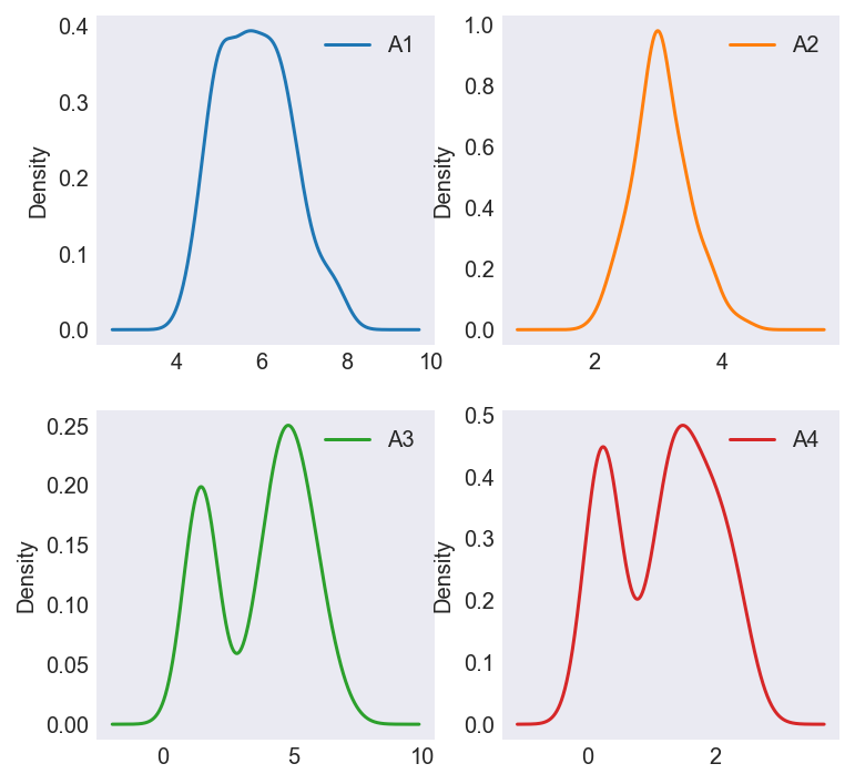
K-Means is one of the most intuitive and easiest to implement unsupervised learning algorithms to discover subgroups in data. It begins by randomly generating centroids in our dataset, finding the (Euclidean) distance from each point to the centroid and recalculating the centroid position until stopping criteria are met. The only parameter we need to pre-specify is the number of centroids (k). To know whether our clustering is any good, we combine notions of cohesion (how far points in a cluster are from their centroid) and separation (how far clusters are from each other) into a ratio called the Silhouette Coefficient which I attempt to maximize. Figure 2 shows this ratio is maximized when we group our dataset into two clusters.
Figure 2
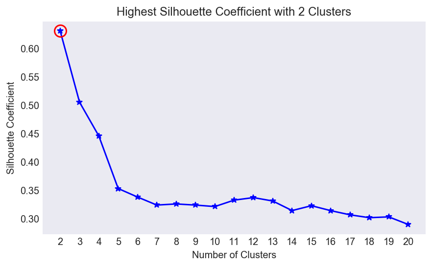
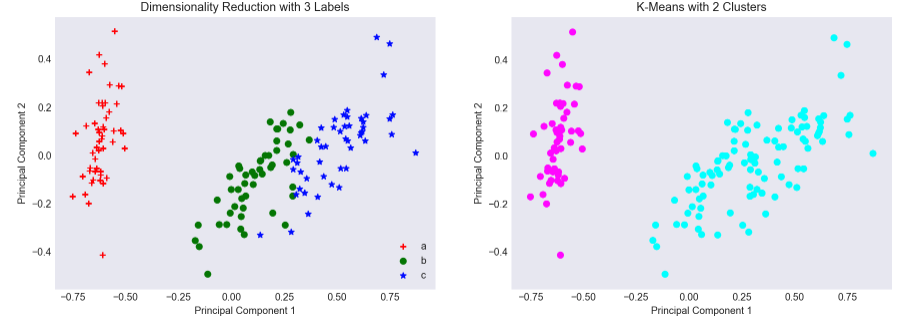
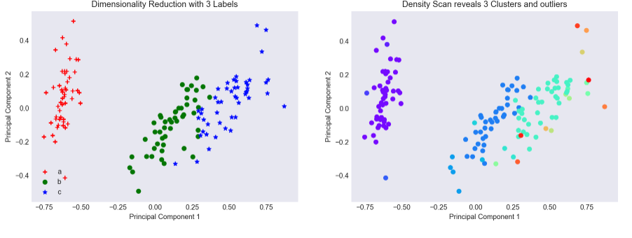
I use Principal Components Analysis to reduce the dimensionality of the original dataset which had 4 features to a 2-Dimensional plane, Figure 3 shows the original dataset on the left and the 2 clusters identified by the K-Means algorithm on the right. Here we see a shortcoming of K-Means. As the variances of the ‘b’ and ‘c’ groups are similar along the first principal component, K-Means identifies it as a single cluster, placing its centroid in between the two groups, essentially grouping ‘b’ and ‘c’ together into a single point.
Figure 3
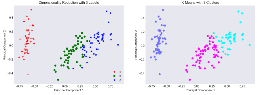
What if we specified that we wanted 3 clusters? Although its Silhouette Coefficient is lower, initializing 3 centroids will do a marginally better job at identifying 3 clusters of data, even though certain points of group ‘c’ are classified as group ‘b’. Put another way, the outlying (top right) points of group ‘c’ shift the group’s centroid of that cluster to the top-right of the two dimensional plane.
Figure 4
Out of interest I examine how well a density based clustering algorithm - DBSCAN - distinguishes between the three groups. Unlike K-Means, we don’t have to pre-specify the number of clusters we’d like, instead merely providing a minimum neighbor count and a maximum radius. Visually inspecting Figure 5 this clustering algorithm appears to do a better job than K-Means at identifying 3 clusters of data. Note the downside of this clustering algorithm is that datapoints that cannot be grouped into one of the 3 clusters are placed into a ‘noise’ clusters.
Figure 5
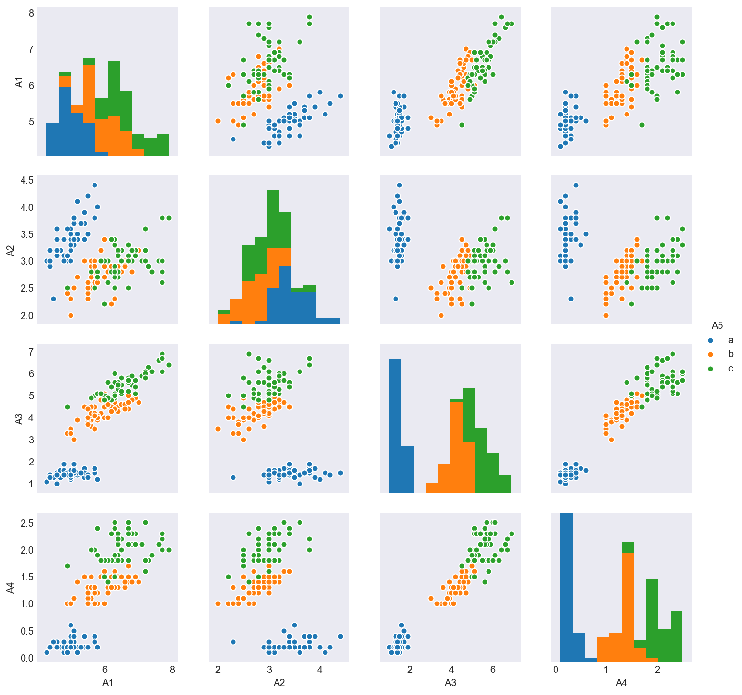
Visualizing scatterplots of our 4 variables two at a time reveals why K-Means failed to properly identify 3 distinct clusters. Figure 6 shows that in every cut of this dataset, ‘b’ and ‘c’ continue to overlap. Only applying PCA was I able to slightly disentangle these clusters.
Figure 6
Advantages and Disadvantages of Clustering Algorithms
While K-Means is intuitive and less computationally intensive especially if ‘k’ is kept low, compared to other clusterers, there are drawbacks. The algorithm is scale dependent and not suitable for data with widely varying shapes or densities as it usually relies on the variance of the distribution of the dataset being spherical. Clusters are also assumed to be of similar sizes and we have to specify the number of cluster centers a priori.
An alternative is the density-based spatial clustering of applications with noise (DBSCAN) algorithm which groups together closely packed points given a minimum number of neighbors and a threshold radius. Unlike K-Means we do not have to specify the number of clusters a priori, although we do specify a neighbor count and radius. It is computationally more intensive than K-Means making it problematic when scaling up to higher dimensional data. DBSCAN will categorize points as ‘noise’ if they are located far away from the cluster center.
Finally, top-down hierarchical clustering, begins by dividing the dataset into 2 clusters and repeating this process within each cluster, until all the clusters are too small or similar. Bottom-up hierarchical clustering, starts with each data item being its own cluster, combining two items that are most similar into a larger cluster and repeating this process until all the clusters left are too dissimilar. K-Means clustering works by dividing data into k sets simultaneously. Hierarchical clustering works well with non-spherical data and as the algorithm is deterministic, you end up with the same cluster each time. K-Means on the other hand, begins with a random draw of the centroids and may yield slightly different clustering results on different runs of the algorithm.
Section 2: Classification Analysis
To predict whether the target variable is a 0 or 1, I used a Logistic Classifier which transforms an underlying linear model using a (sigmoid) function. If the transformed value exceeds a threshold (by default 50%) this maps the output to Class 1 otherwise to Class 0. By identifying features with the highest explanatory power, a Logistic Classifier leads to a more intuitive (linear) explanation than using a CART Classifier such as a Random Forest or a Boosted Decision Tree, even though the latter may have higher classification accuracy. With the coefficients of the logistic regressor, we can say the more of A6-A10 and A13, the greater the likelihood of being in Class 1. To benchmark the performance of my Logistic Classifier, I use a similarly intuitive KNN Classifier, which groups clients into Classes based on their neighbors e.g. the travel habits of residents who live close to the city are similar.
EDA and Preprocessing
Exploratory Data Analysis reveals 70% of the target variable is Class 1 and 30% is Class 0. This imbalanced class problem means that any model that predicts the entire target variable is Class 1 has a 70% Accuracy. To gauge how well my classifer has done, I use the area under the Receiver Operating Characteristic curve as my performance evaluation metric. As it only compares incorrect labelling assignments - the true positive rate versus the false positive rates - it is unaffected by the distribution of class labels.
Figure 6 examines the distribution of all features and target values. Features A21 to A24 are categorical, able to take values A, B or C, and do not appear. I use dummy variables represent these categorical points, dropping A21_A, A22_A, A23_A and A24_A to avoid the dummy variable trap. These binarized features are then added back to the quantitative features: A1 - A20.
Figure 7
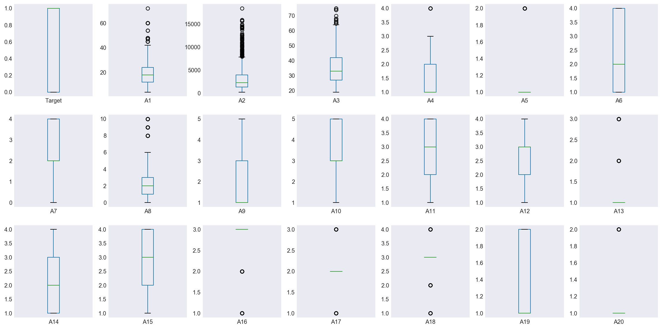
Note the variances of features A1-A3 are much higher than the remaining features and A2 in particular has a large number of outliers. I apply a robust standardizer to scale these features. Finally I note the minimum values of A7 and A8 are 0 whereas the minimum values for all other non-binary features are 1. I assume that zero is not a placeholder for NULL values and actually represents the value of zero.
Train-Test Split
I use a 70-30 Train-Test split keeping the 30% holdout set till the very end where I use the trained model on it.
Logistic Classifier on Training Data
As a baseline, I use a Dummy Classification model which takes the mean of each robust-standardized feature as a regressor and uses these to to classify the target variable into Class 1 or Class 0. The Dummy Classifier has an accuracy score of 60.582% and area under the ROC curve under 50%. This Dummy Classifier does worse than random guessing. Note that in terms of accuracy score this dummy underperforms a model that simply predicts the target variable is always Class 1.
I employ a Logistic Classifier which transforms a linear model of all 24 features using a sigmoid function to predict whether the target variable will be Class 1 or 0. Running a Stratified 10 fold cross validation (to avoid overfitting) on the training set the model has an average ROC_AUC of 75.1%. I run a gridsearch optimization to determine the optimal value of the inverse regularization parameter ‘C’ that maximizes ROC_AUC to 76.3%%. The optimal value of ‘C’ is 5 which suggests a moderate degree of regularization. However this hypertuning doesn’t significantly move the needle.
Top Features and a ROC
The most important features based on coefficients are A6, A7, A9 and A10. I re-run a Logistic Classifier that uses the underlying four factor model and it returns a 10 fold cross validated AUC of 73.064% on the training dataset.
The ROC curve an easy way to visualize the performance of a binary classifier. The x-axis represents the false positive rate (% times the model predicts Class 1 when the Class is 0) while the y-axis represents the true positive rate (ability to accurately predict a class). We want to maximize the area under the ROC curve which occurs at the top left of Figure 8. Here the True positive rate is 1 and the false positive rate is 0. An AUC of 1.0 is a perfect model, where the classifier never makes a mistake.
Figure 8
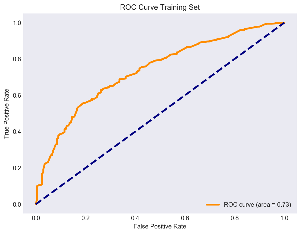
For the training set the area under this Logistic Classifier based ROC curve is 73%, which means we make a mistake 27% of the time when classifying clients as 1 or 0. This is better than random guessing or employing the Dummy Classifier.
Logistic Classifier on Test Data
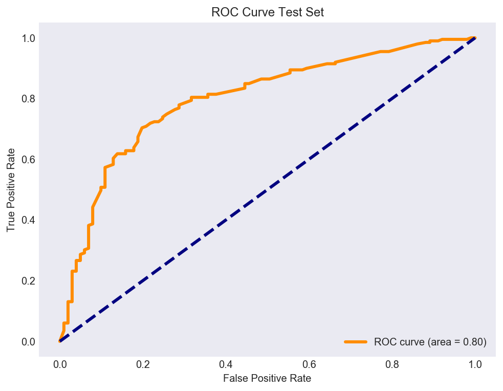
Using the same four factor model based logistic classifer on the holdout set, results in an AUC of 80% which gives us some confidence on using this model to classify clients as 1 or 0. We only make a mistake 20% of the time when trying to accurately classify clients.
Figure 9
KNN Classifier on Training Data
A KNN Classifier, is another wonderfully intuitive model. It says that certain clients are more likely to be similar to their neighbors. If the features of Client 1 for example are similar to 10-12 other clients, then we can group these clients together into a group. As an example, we may expect the spending habits of upper middle class neighborhoods to be similar.
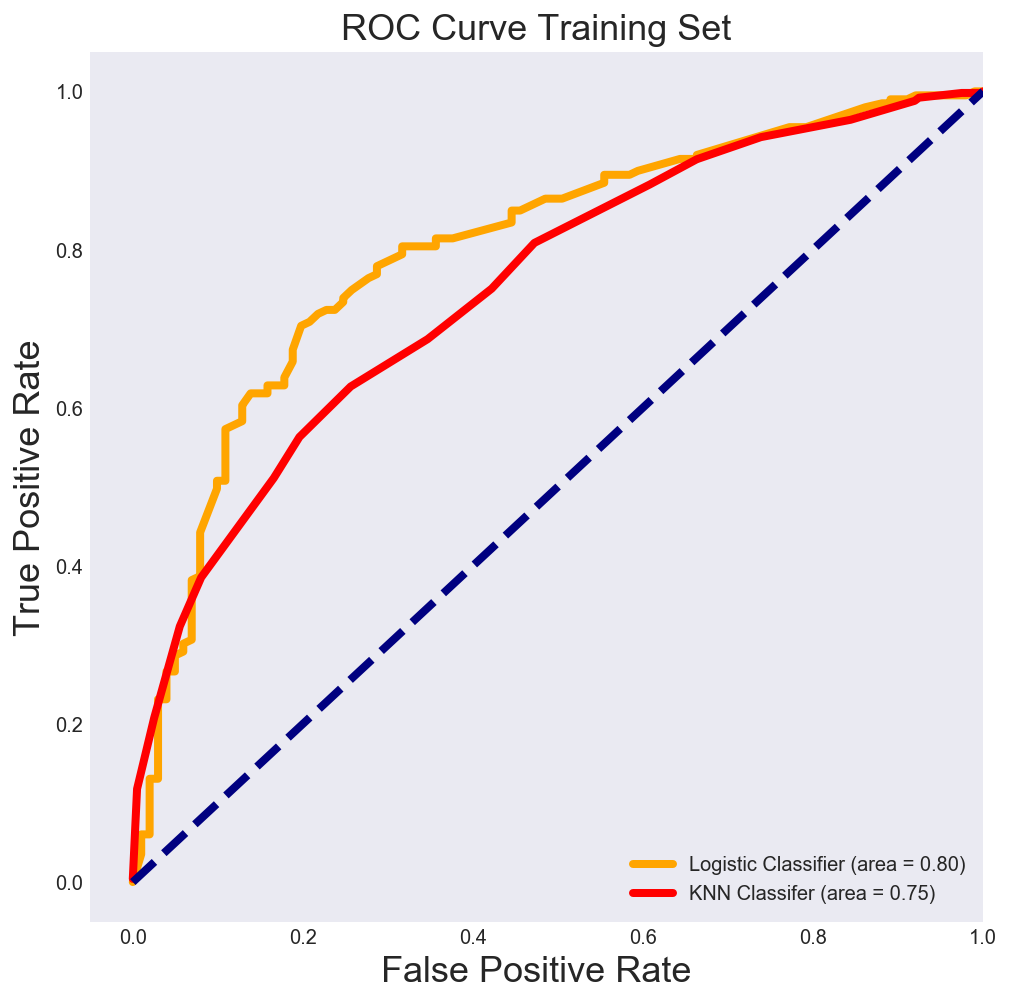
Once again running a hyperparameter tuned 10-Fold KNN Classifer on the dataset, I find the optimal number of neighbors is 29! This means that knowing a particular datapoint and the 29 points closest to it gives us a higher likelihood of being in the same group. The Area under the ROC curve is slightly lower than the Logistic Classifier as shown in Figure 10, meaning that it is slightly less accurate at correctly predicting client Class.
Figure 10
KNN Classifier on Test Data
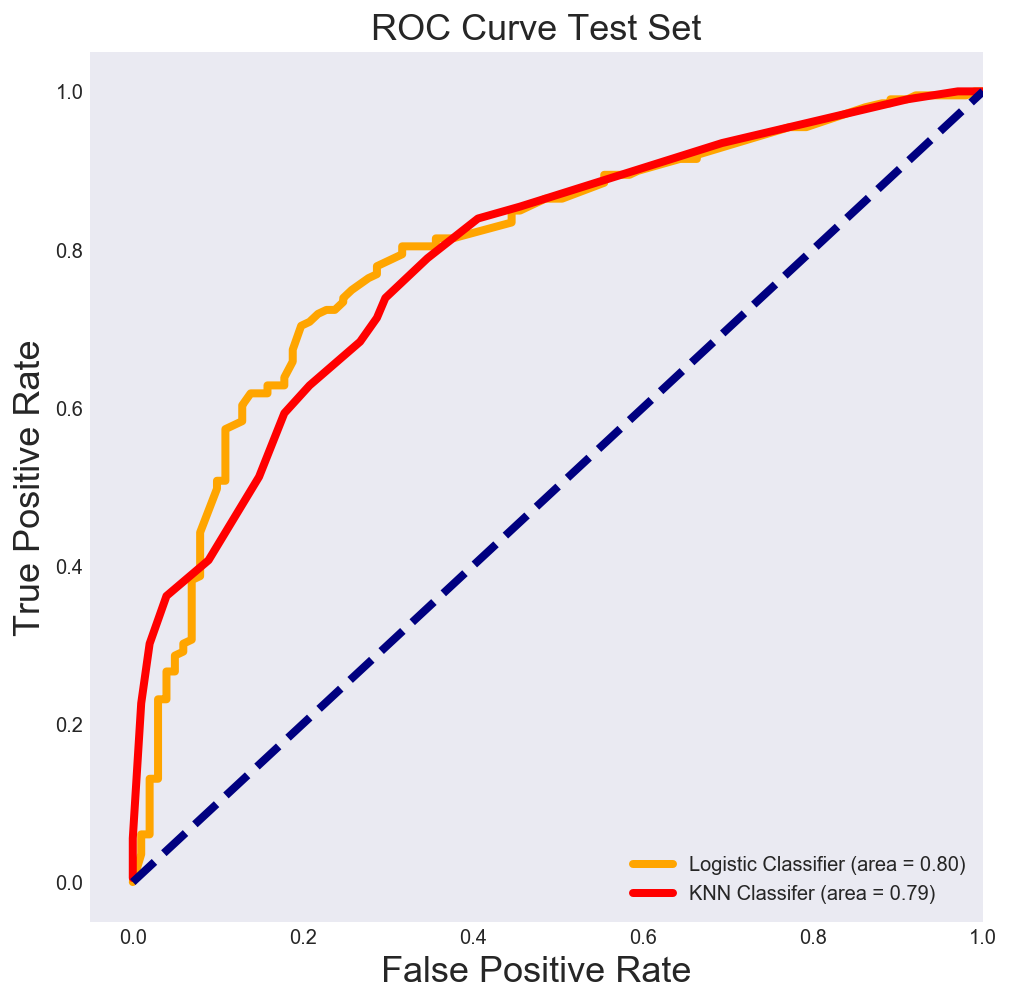
Finally running the KNN Classifier on the test dataset, we find that it performs on par with a the Logistic Classifier. Both classifiers correctly classify 80% of clients as Class 1 or Class 0 on a dataset that was not optimized on.
Figure 11
Final Thoughts: Alternative approaches of tackling the imbalanced class problem
A simple logistic classifier correctly sorts clients into Class 1 or 0, 80% of the time while a K Nearest Neighbors Classifier gets this right 79% of the time on an out of sample dataset. I would be interested in exploring how a Random Forest Classifier or a Boosted Decision tree performed on this dataset but this non-linear comes with some cost to comprehensibility.
I used the ROC curve given its insensitivity to imbalanced classes. An alternative technique is the synthesis of new minority classes using Chawla’s SMOTE (Synthetic Minority Oversampling Technique) system. The idea is to create new minority examples by interpolating between existing ones. A disadvantage of SMOTE is that it operates by interpolating between minority examples, so it can only generate examples within the body of available examples—never outside. The relevant library can be found here